
Cover
KOHO · 2023
Timeframe: Discovery to launch, ~1 month
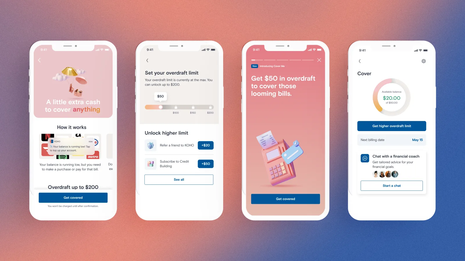
KOHO is a Canadian fintech - a prepaid card and spending account built as an alternative to the big five banks. Cover is its subscription overdraft protection: it extends small amounts of credit so people can absorb an essential expense without a fee and without stress.
I led the product design for Cover as a 0→1 consumer product, with a PM, an EM and three engineers. Most of what's below happened after that first release.
Problems
The MVP worked well, but had two issues:
- People weren't finding it - we weren't getting enough traffic
- Those who did had a hard time trusting it enough to start a trial
Discoverability & Polish
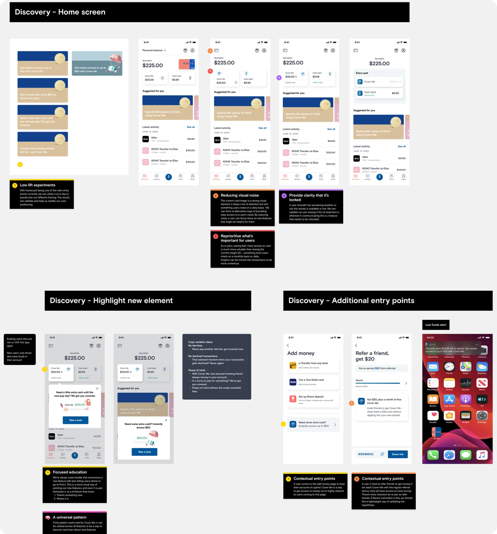
We identified discoverability as the single biggest lever on adoption. I explored a number of different solutions. While it's obvious the solution would be to put it on the home screen, the interesting work was more around how to make it present without being pushy, as well as taking into account all the other features we want to display.
The first feature story lifted adoption by about 5%. Rather than take the win, I built additional variations and put them into an A/B test. The optimised version beat control by 4.6%, and the winning treatment became a feature-story pattern we reused for any new features going forward.
From MVP to a lovable product
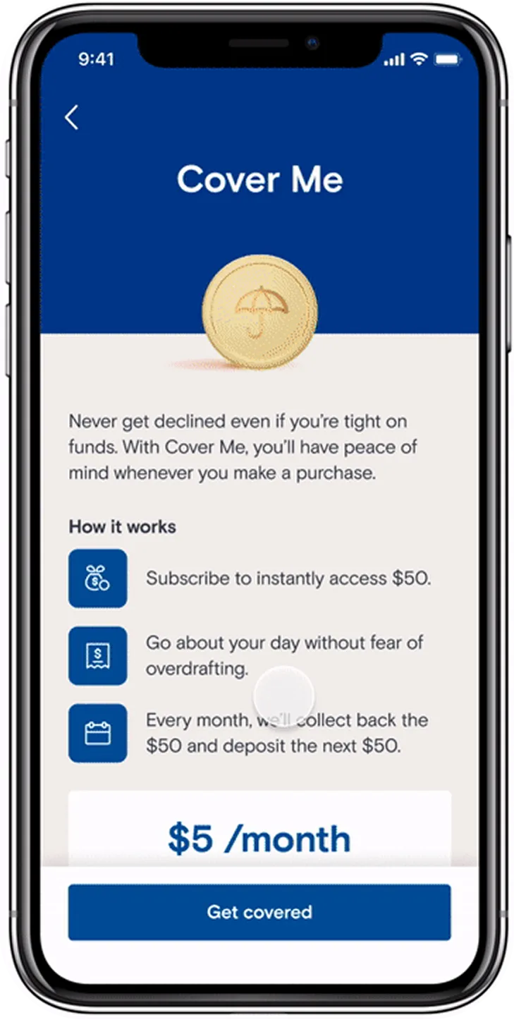
The rest was accumulation of details. Simplifying eligibility so people could tell whether Cover applied to them without reading twice; tightening hierarchy so the important number was the first thing you see; keeping patterns consistent with the rest of KOHO, because consistency is most of what trust is made of in a banking app; and adding motion to achieve a more polished feel.
The bottom line is, someone deciding whether to borrow $50 four days before payday should be able to tell what it costs and what happens without reading all the fine print.
Together these changes made the difference between a credit product that reads as a service and one that makes users wonder if there's a gotcha they just haven't caught yet.
Key takeaways & impact
- +5% adoption - from the first feature story, once Cover was surfaced on the home screen instead of behind a menu
- +4.6% over control - the optimised variant in an A/B test, which is a measured number attached to craft rather than an assertion about it
- A pattern, not a screen - the winning feature story became the template we reused for any new feature
Most of my work is complex systems: platform primitives, governance models, things whose value is legible mainly to the admin operating them. Cover is on this site because it's the opposite, and because I don't think the two skills are separable. It's where the craft is doing the work - the subtle details, the motion, the narrative that makes an experience feel trustworthy.